My grief with “In Brief”
Just to preemptively state it: I appreciate what the Accessibility Guidelines Working Group (AGWG) is trying to do with the “In Brief” sections in WCAG’s Understanding documents. My criticism is about the execution of the information. In addition, this is not a plea to change it. I think the WG is very set on its approach and I learned it’s almost impossible to make it reconsider, so I don’t even want to bother trying. This is mostly documentation for myself.
Table of Contents
What are “In Brief” sections?
“In Brief” sections are information that has been added to every single WCAG Success Criterion Understanding page. They contain three bits of information: The goal of the success criterion, what to do to reach that goal, and why it is important to not violate the success criterion. Take for example the “In Brief” section for SC 1.3.1 Info and Relationships. First, the full Success Criterion as a reminder:
Success Criterion 1.3.1 Info and Relationships (Understanding)
(Level A)
Information, structure, and relationships conveyed through presentation can be programmatically determined or are available in text.
And here is the “In Brief” section from the Understanding document1 :
- Goal: Information about content structure is available to more people.
- What to do: Use code to reinforce relationships and information conveyed through presentation.
- Why it's important: People can adapt the presentation to suit their needs while preserving the original meaning.
What is the goal of the “In Brief” sections?
The goal is to give people who are new to WCAG an easier to understand way to know what a Success Criterion is about. I think that is a great goal. The second goal stated in Shawn Lawton Henry’s comment on GitHub is to focus on disabled people’s experiences instead of (purely) conformance.
I think those are great goals.
Why I don’t like the current implementation of “In Brief” sections
I have multiple problems with the “In Brief” section as they are currently implemented. I hope some of them can be addressed, but I don’t hold my breath.
Support Eric’s independent work
I'm a web accessibility professional who cares deeply about inclusion and an open web for everyone. I work with Axess Lab as an accessibility specialist. Previously, I worked with Knowbility, the World Wide Web Consortium, and Aktion Mensch. In this blog I publish my own thoughts and research about the web industry.
1. Position/Design
For some time now, the “In Brief” sections are displayed between the Success Criterion title (and page heading) and the actual text of the success criterion (and non-normative notes quoted from WCAG).
In the WCAG 2.1 version2 of the Understanding documents, the “In Brief” section was only added to a few SCs. It was put underneath the Success Criterion boxes, and at least on desktop browsers, it was clear that the first part of the page was the Success Criterion and then the explanation followed.
I always thought that the visual distinction was a bit confusing, but at least it felt clear to me that the top had the success criterion and the bottom explains it.
Side note: While the pages always included the normative terms from the WCAG glossary, a reader might not identify them as such. They have also been renamed to “Key Terms” and collapsed as a section, further de-emphasizing their importance.
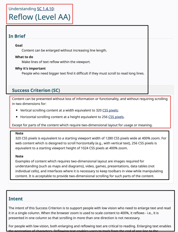
With WCAG 2.2, the “In Brief” sections were initially kept underneath the success criteria. But then got promoted to the most prominent place on the page, directly underneath the main heading.
The technically normative Success Criterion name is now followed by non-normative text, followed by the SC box (which contains the normative text of the SC and quotes non-normative notes), followed by explanatory text until the “Key Terms” expand/collapse which content itself is quoted normative content.
I’ve visualized the normative/non-normative balance in the following screenshot:

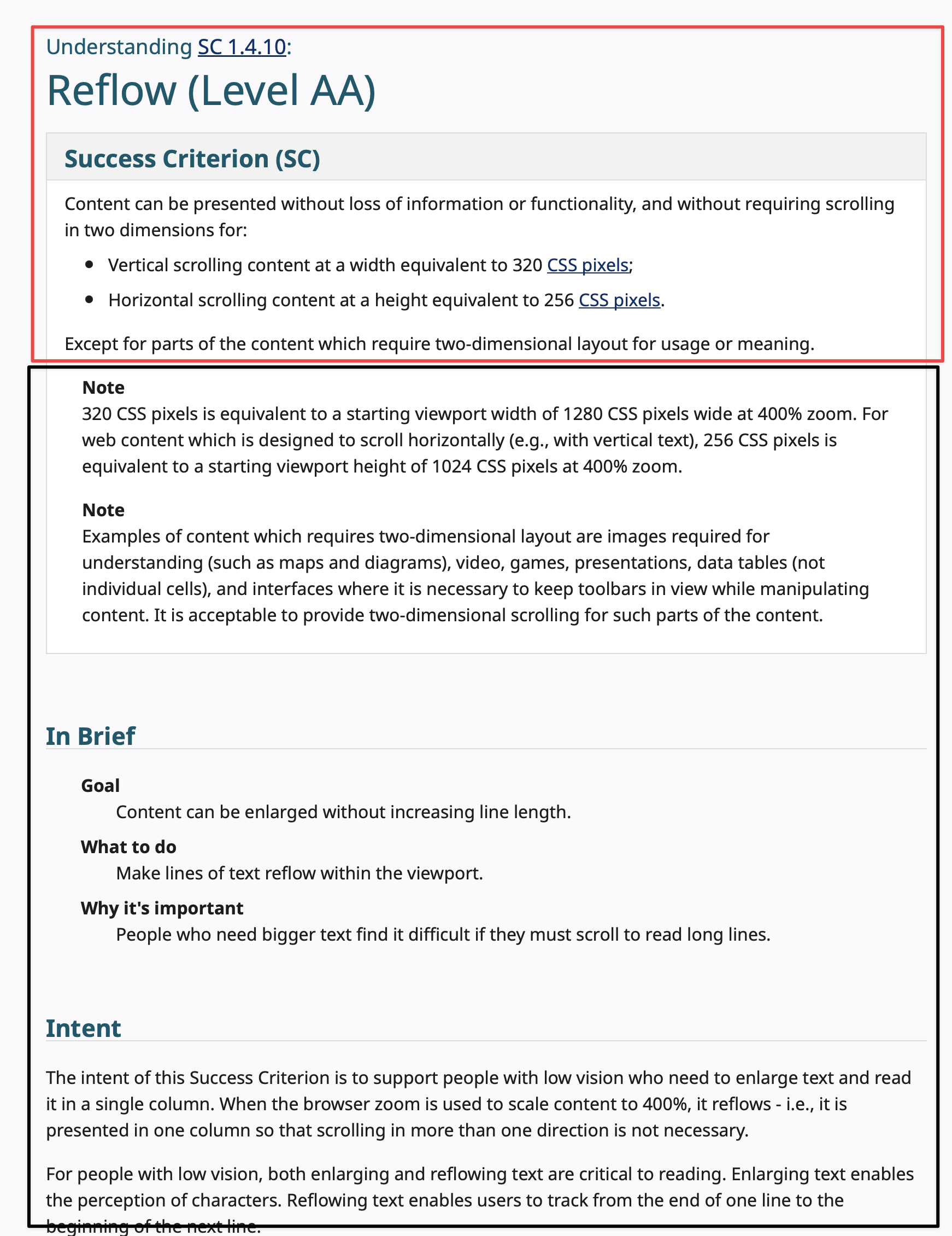
Compare this to a screenshot with the “In Brief” and “Success Criterion (SC)” box switched:
I would even argue to integrate the heading and the SC text even better, getting rid of the SC box and maybe letting go of the notes altogether, since they are basically mini-understandings inside the specification.
Now, this would not be a big deal, if it was just a little more confusing to me, but there are reports of other people finding the Understanding documents harder to use. I have been quoted “In Brief” information as if it were normative text by clients. I opened an issue in June, and another one was opened in July.
One seemingly helpful suggestion was to link to the Success Criterion box directly (Example) by adding #success-criterion to the URLs that I share. But that hides the name of the Success Criterion and its number3
and is disorienting. It also removes the branding from the link which is important to say “See, I’m not guessing, there is official information about this.” and helps with credibility.
2. Content/Information
Let’s talk about the actual content of the “In Brief” sections. Let me re-quote the 1.3.1 Info and Relationships one for you:
- Goal: Information about content structure is available to more people.
- What to do: Use code to reinforce relationships and information conveyed through presentation.
- Why it's important: People can adapt the presentation to suit their needs while preserving the original meaning.
I picked this SC basically at random. This is not a good explanation of why 1.3.1 Info and Relationships is important at all, or how to do it. It uses jargon language that is also vague. It also does not cover the whole SC.
And this is a pretty easy to explain success criterion:
Information that is clear for people who can see the screen must be either available in text or in (HTML) code to allow assistive technologies to read this information. It also allows for adaption of the information to user’s needs. A heading must not only look like a heading, but be marked up like one. Screen reader users can then navigate from heading to heading, low vision users might decide to increase the size of headings or use specific colors to make headings easier to find.
Is this longer than the “In Brief” section? Yes, but it is also clearer for anyone reading it. Not only does it help to use full sentences, it also uses concrete examples and little jargon. This can be word-smithed for sure, it’s literally a first draft.
I also think that the goal of putting the focus on disabled people’s lived experiences is not really met with the “In Brief” as it is. 1.3.1 above talks about “more people” and that “people can adapt”. Disabilities are not even mentioned in many “In Brief” sections. Sometimes assistive technologies are used in the abstract without concrete use cases. SC 1.3.4 Orientation (AA)’s “In Brief” does a good job with its “Why it’s important” sentence: “Wheelchair users and others may have devices mounted in a fixed orientation.” Expand it to “Wheelchair users and others may have devices mounted in a fixed position, so allow that your content can be viewed in both, portrait and landscape orientation.”
3. Audience
And that brings me to the third point: What is the audience of the Understanding documents? For years, the audience was people who had the need to distinguish between pass and fail states. But they also helped clients to understand why we would fail something.
Having the SC and then supporting it with examples and different fail/pass cases is incredibly useful. It was never the most clear and best tool for the job, but it worked. Practitioners included links to it in audit reports and clients found it useful.
Since the change to “In Brief”-first listing, I had colleagues and clients confused. People share user styles to hide the section.
The Understanding documents try to be all things to all people, but they must be concise and helpful for conformance.
What to do?
Having an overview for users who are new to WCAG without all the baggage of the Understanding documents is a great idea. And it already exists somewhat in the What's New in WCAG 2.1 and What's New in WCAG 2.2 resources, which are specifically created for people new to WCAG. (Here I also prefer the WCAG 2.1 approach of showing the Success Criteria first and then explaining it.)
In any case, WCAG 2 and its Understanding documents are not the right place to start – How People with Disabilities Use the Web is a great resource to understand why accessibility is so multi-faceted. It’s a much better start. And yes, integrating these resources in the Understanding, or at least linking to them, is useful for many people.
I’m all for making the Understanding documents easier to understand, but adding more content is not the best way to go about. Every Understanding page has an intent section that already does a good job of explaining what the SC does:
The intent of this Success Criterion is to ensure that information and relationships that are implied by visual or auditory formatting are preserved when the presentation format changes. For example, the presentation format changes when the content is read by a screen reader or when a user style sheet is substituted for the style sheet provided by the author.
I think it’s clear that some de-jargoning and using simpler sentence structure would meet the goal of making the Understanding pages easier to understand without sacrificing their utility.
I think explaining WCAG success criteria in brief is not a good proposition in the first place. The Success Criteria are of varying complexity, but they all deserve that interested people read and analyze them. Sure, the approach to actually explaining WCAG SCs in detail (like I did for 1.4.11 Non-Text Contrast (User Interface Components) recently) will take them more time, but they also will have understood more of the nuance of the SC. There I start with rewriting the relevant part of the SC into more prose and then analyzing every part of the wording. This matters because it helps to form an understanding of how WCAG works.
Support Eric’s independent work
I'm a web accessibility professional who cares deeply about inclusion and an open web for everyone. I work with Axess Lab as an accessibility specialist. Previously, I worked with Knowbility, the World Wide Web Consortium, and Aktion Mensch. In this blog I publish my own thoughts and research about the web industry.
Other examples
SC1.2.2 Captions (Prerecorded)
Several days ago, I posted my problems with the “In Brief” of SC 1.2.2 Captions (Prerecorded) (A) on Mastodon. It reads:
- Goal: Videos can be played with captions.
- What to do: Provide synchronized text for audio content in existing videos.
- Why it's important: People who are deaf or hard of hearing can understand audio in videos.
Here, I especially don’t like that it says, “People who are deaf or hard of hearing can understand audio in videos.” The whole SC is about an alternative for the audio in videos. It is about making information in the audio of videos perceivable4 for d/Deaf and hard of hearing individuals.
In addition, “synchronized text” is more jargon than captions or subtitles. I can understand that you don’t want to repeat “captions” in all three sentences. But the uniformity of the advice is a self-afflicted constraint. “Videos can be played with captions” sounds a little like a technical problem, however, providing captions for media needs planning, some design decisions, and the infrastructure to make it work.
SC 2.5.8 Target Size (Minimum) and 2.5.5 Target Size (Enhanced)
For SC 2.5.8 Target Size (Minimum) (AA), the “In Brief” section reads (as pointed out on Mastodon, too):
- Goal: Make controls easier to activate.
- What to do: Ensure targets meet a minimum size or have sufficient spacing around them.
- Why it's important: Some people with physical impairments cannot click small buttons that are close together.
For SC 2.5.5 Target Size (Enhanced) (AAA), the “In Brief” section reads:
- Goal: Controls can be operated more easily, especially on touch screens.
- What to do: Make custom targets at least 44 by 44 pixels.
- Why it's important: Some people cannot tap small objects.
Again it uses jargon, “targets”, “minimum size”, “sufficient spacing”. The enhanced even says it applies to “custom targets”, something that is not defined or explained anywhere. And instead of naming disabilities that are concrete, it’s “some peopled” again. People with hand tremors or spasms are good examples of people who depend on large targets, whether they click or tap.
Minimum even names an exception as part of the “In Brief” which I’m not a fan of. Exceptions are compromises, not part of the guidance that I would expect on such an intro-level.
Updates
- September 8th, 2024: Added second other example.
- In contrast to the actual understanding document, I use an unordered list instead of a description list. ↩
- Please ask the AGWG about the existing of different explainer documents for normative requirements which have exactly the same wording. ↩
- Why are the numbers so small, btw? ↩
- In my experience, mixing perceivable and understandable when explaining WCAG concepts can lead to confusion, too. I try my best to use “perceivable” when explaining SCs/issues in the Perceivable principle, and reserve “understand” for the Understanding principle. ↩
Comments & Webmentions